- 9 min read
- Tips
Think You Need Your Logo Bigger? Think Again.
You’ve spent time, energy (and well let’s be honest, money 💰) getting your brand off the ground. You’ve got the passion, the purpose, and the business idea to back it up. But there’s one thing bugging you every time you look at your fresh new website or marketing materials:
“Shouldn’t the logo be... bigger?”
We get it. It’s your baby. Your mark. Your identity. But before you ask your designer (again) to supersize it, let’s have a little chat about why bigger isn’t always better when it comes to logos.


3 Common Reasons Clients Want a Bigger Logo (and Why They Don’t Hold Up)
1. "I want people to notice it first."
It’s understandable to want visibility. But making your logo huge can backfire by disrupting the balance of your layout. Good design guides the eye where it needs to go and often, that's to your message or call to action, not the logo. A well-placed, proportionate logo does its job quietly.
Trust us – when everything shouts, nothing gets heard. Your logo is part of the supporting cast that makes your headline, CTA, or key message the star of the show. Let your brand breathe, and you’ll find that clarity and flow create more impact than scale ever could. Good design isn’t about filling every inch. It’s about knowing when to step back.
2. "It doesn’t feel important enough."
Big doesn’t always equal important. Some of the most iconic brands use their logos modestly because their identity is baked into the entire experience. Importance comes from consistency, not scale.
Think of brands like Spotify, Chanel or Airbnb. They use their logos with subtlety. Their confidence comes from consistency, cohesion, and experience design, not visual dominance. When your branding is strong across the board, your logo doesn't have to do all the heavy lifting. It fits in, supports the story, and adds to the trust.
3. "Competitors have theirs bigger."
Chasing what others are doing isn’t the move. You don’t want to blend in; you want to stand out for the right reasons. Mimicking competitions just to feel equal can dilute what makes your brand unique and unmistakably you. Oversized logos can look dated or try-hard, especially in a minimal, modern design landscape.
At the end of the day, you’re not trying to be your competitors, are you? You want to be better. That’s the whole point – differentiation. Your brand should reflect your values, personality, and design language – not follow someone else's lead.

Your Logo Is Not Your Brand
Despite what you might think, your logo isn’t everything 🙅♀️. In fact, it’s only a tiny part of the story. Your logo alone won’t carry your brand – it’s not supposed to. It’s a marker, not the message.
Your logo is a part of your brand, but it’s not the whole story. The fonts you use, the tone of your voice, the images you choose, even the white space you don’t fill – all of it adds up to how people perceive your business. It's your signature, sure. It needs to be recognisable, yes. But it doesn’t need to shout to be heard.
A great example of a brand whose logo became iconic after years of strategic brand-building is Airbnb.
When Airbnb first launched, its branding was inconsistent – early logos were forgettable and lacked a clear identity. It wasn’t until their major 2014 rebrand that they introduced the now-recognisable "Bélo" symbol. Even then, the logo didn’t become iconic overnight. What made it iconic was everything else they did: their shift in brand strategy, their storytelling around belonging, their consistent tone of voice, their curated photography, and their UX design.
They created a full brand experience that made the logo mean something. Today, the symbol stands for community, trust, and global travel but only because the brand did the hard work behind the scenes to build that association.
So, when people recognise the Airbnb logo now, they’re not reacting to the shape alone, they’re reacting to the brand story they’ve come to know. That’s the power of brand-building beyond the logo.
Bigger Logos Don’t Equal Stronger Brands
Here’s the brutal truth: slapping a massive logo on your homepage doesn’t make your brand feel more established. In fact, it will probably do the opposite. It can look clunky, overbearing, and (dare we say) desperate 🫣.
Some of the best brands out there understand that confidence often comes from restraint. When you see a small, perfectly placed Apple logo or Nike swoosh, does it feel weak? Not at all. It feels iconic. Powerful and in control.
What Should You Focus on Instead?
If you’re tempted to up the logo size, ask yourself:
Is my messaging clear?
Does my brand look cohesive across platforms?
Is there enough white space to let the design breathe?
Are my visuals drawing the eye where I want it to go?

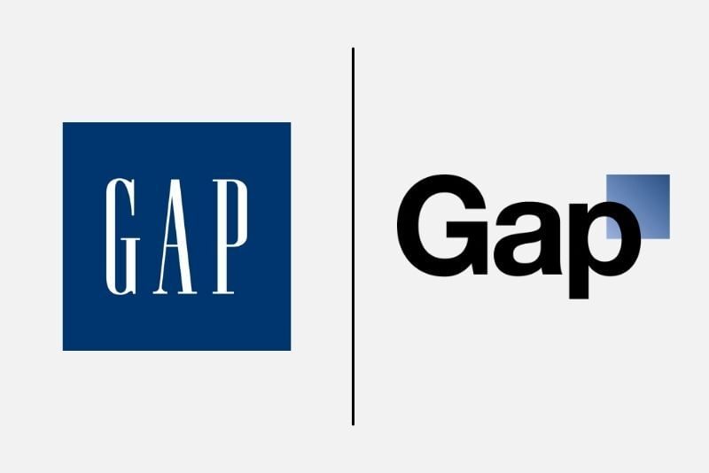
A prime example of a brand that learned the “bigger isn’t better” lesson is Gap.
In 2010, Gap attempted a rebrand that featured a new, larger and more modern-looking logo. The traditional blue box was swapped out for a minimal, Helvetica-style font with a floating gradient square. The result? Backlash … massive backlash. Customers said the new logo felt generic, soulless, and completely disconnected from Gap’s identity. And it was clear the large, dominant logo looked out of place.
Within just six days, Gap reversed the decision and reinstated the original logo. So what’s the lesson here? A logo (big or small) can’t make up for the emotional connection people have with your brand. And when it’s oversized or out of sync, it breaks the trust and familiarity your audience has come to expect.
In Gap’s case, their audience reminded them that subtlety and legacy were far more powerful than a loud refresh
What We Do at Genesis
At Genesis, we design with purpose. If we ever say "no" to a bigger logo, it's not to be awkward, it’s because we want your brand to look intentional and powerful. We want the focus to be on what matters: your story, your offer, your impact.
We don’t just stick logos on things – we’re here to build brands that do the talking for you.

So... Do You Still Want It Bigger?
You might. And that’s okay. But before you hit Ctrl + Shift + Enlarge, have a think about what you’re really trying to say.
If the answer is “I want people to see me,” let’s work together to make sure your whole brand is doing just that, logo size aside.
Want a second opinion on your visuals? Or just want to rant about your old branding decisions? We’re here for all of it – get in touch.
You might also like
Discover all articles
What Is a Branding Agency Though?
- 10 min read
- Tips
We get it. The term “branding agency” sounds a bit vague, doesn’t it? You’re not alone if you've ever thought:
"Do they just design logos? Or is it something more… fluffy?"
Well, allow us to clear things up. Despite what other people might tell you, branding isn’t just a logo (shocker, we know). It’s so much more than that.
Your brand is how people feel when they interact with your business. It’s the vibe, the voice, the visual identity, all working together to leave a lasting impression. That gut instinct people get when they see your packaging, or have a nosey at your website? That’s your brand, doing its thing 👌.
A branding agency exists to help shape, craft, and grow that feeling. At Genesis Creative, we help businesses articulate who they are, define what makes them different, and bring it all to life through strategy, storytelling, design, and experience. It goes beyond just being seen. It’s all about being understood, trusted, and remembered.
